Designs by Colville-Andersen
-

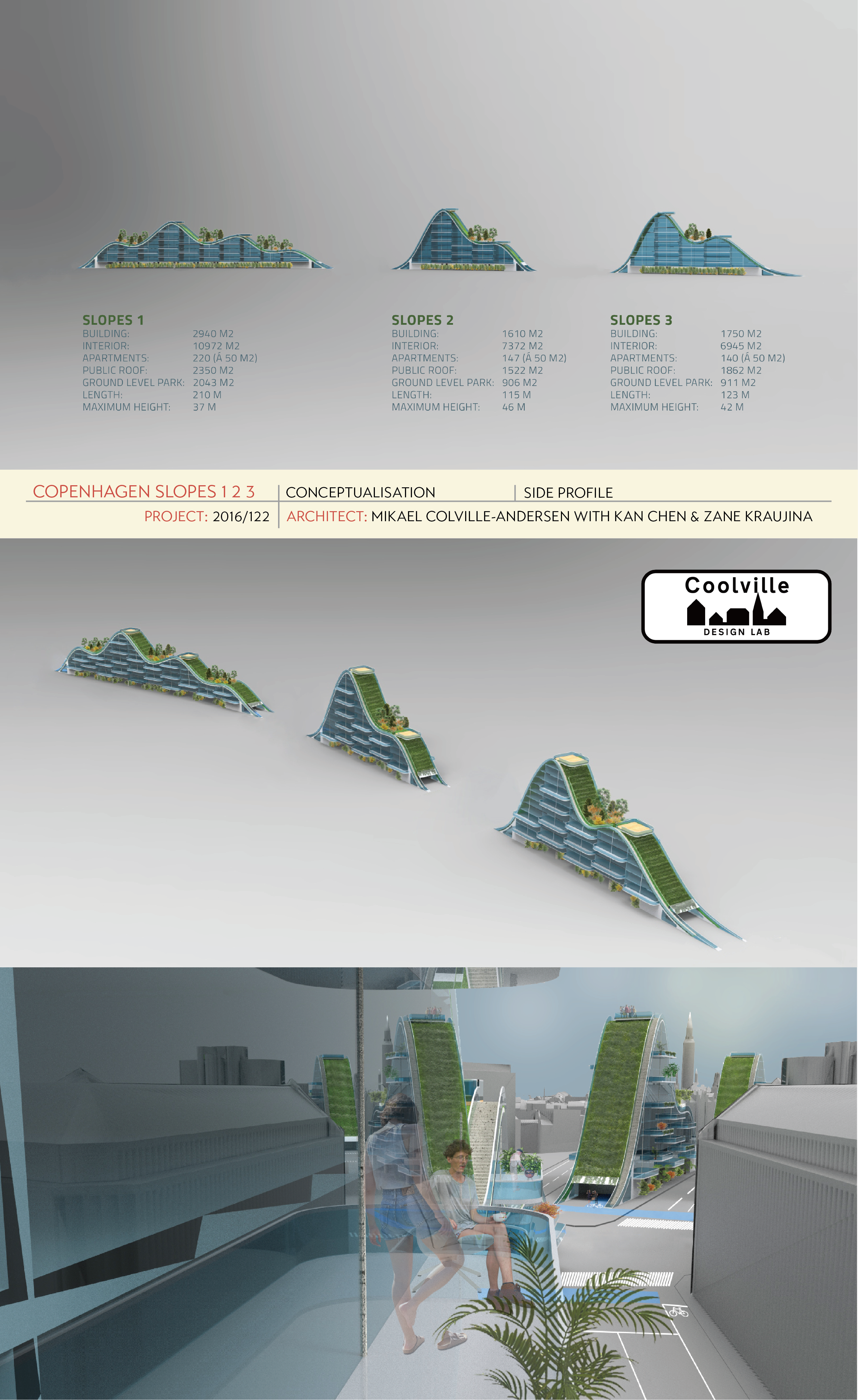
Copenhagen Slopes
Denmark’s busiest street - Hans Christian Andersen Blvd with 60,000 cars a day - has greater potential. Mikael proposed this conceptualisation for three iconic buildings with 500 apartments to help the city’s housing problems. Not to mention forcing a drastic reducation in car traffic through the heart of the city. Needless to say, it irritated many motorists when it hit the Danish press. Which is awesome.
Visuals: Kam Chen / Status: Concept
-

Cargo Bike Logistics Depot
With the return of the cargo bike to our cities, it’s time to rediscover that other lost opportunity - using our rivers, harbours and waterfronts for transport and logistics. From a distribution point outside the city, packages can be delivered by barge or boat to these specially-designed depots, from where cargo bikes can tackle the last-mile delivery. Eliminating a great number of trucks and vans from our streets.
Visuals by Adina Visan / Status: Concept
-

MCA/13 Cargo Bike Parking
Copenhageners have 50,000 cargo bikes and these workhorses are increasing in popularity around the world. Secure parking remains an issue and one without any solid solutions. Until now. Mikael raised the bar when he designed this on-street cargo bike rack.
Status: Protoype and testing
-

Bike Parking Copenhagen Central
The City of Copenhagen announced a parking facility for 7000 bikes at Central Station in 2008. Then nothing happened. So Mikael decided to explore what it might look like by designing this facility with architect Steve Montebello. He found space for 7550 bikes and cargo bikes behind the station.
Status: Concept
-

Stormwater Drainage Meets Bicycle Urbanism
Copenhagen, like many places, sufferes from excessive rainfall as a result of climate change. Flooded streets are a regular occurance. The sewers can’t handle the volume. So how about a cut and cover solution to catch the stormwater, lead it away and create space for excellent bike infrastructure on top?
Status: Concept
-

The Love Handle
Cycling citizens lean up against their city whenever they can. To accommodate this inherent behaviour, Mikael designed this handle for them to hold on to. He tested it in Copenhagen at six locations and monitored the use. He even put one up in Amsterdam, where it stayed in place for two years.
Status: Concept
-

Ignoring Last Century Engineering
When asked by a client city to try to fit pedestrian and bicycle infrastructure onto a car-centric Double Diamond Interchange (DDI), it was quite impossible. So why not just ignore it and give pedestrians and cyclists a safe way across.
Status: Concept
-

Visual Activism
Even Copenhagen isn’t perfect. Nordre Frihavnsgade is a street that still lacks safe infrastructure. Together with Ole Kassow and Thomas Lygum, Mikael visualised what the street would look like as a bicycle street. After it was published on his blog and in Danish papers, the City gave in and revisited the street and the options available. Visual activism changed the conversation.
Status: Redesign of the street is pending
-

Visual Stimulation
We can talk for ages about change but showing what it will look like changes the conversation. Mikael transformed this iconic intersection in Paris in Photoshop with Best Practice design and helped change the conversation in the French capital about what direction it should take in further developing its bicycle network.
Status: Visualisation/activism
-

Innovation in Amsterdam
Sensors in the asphalt triggering traffic lights further along are not new but Mikael brought gamefication to the cycle tracks with this big red button that, when pressed (or slammed) starts the light signal change 100 metres ahead, at the intersection. Designed for an idea catalogue for the City of Amsterdam.
Status: Concept
-

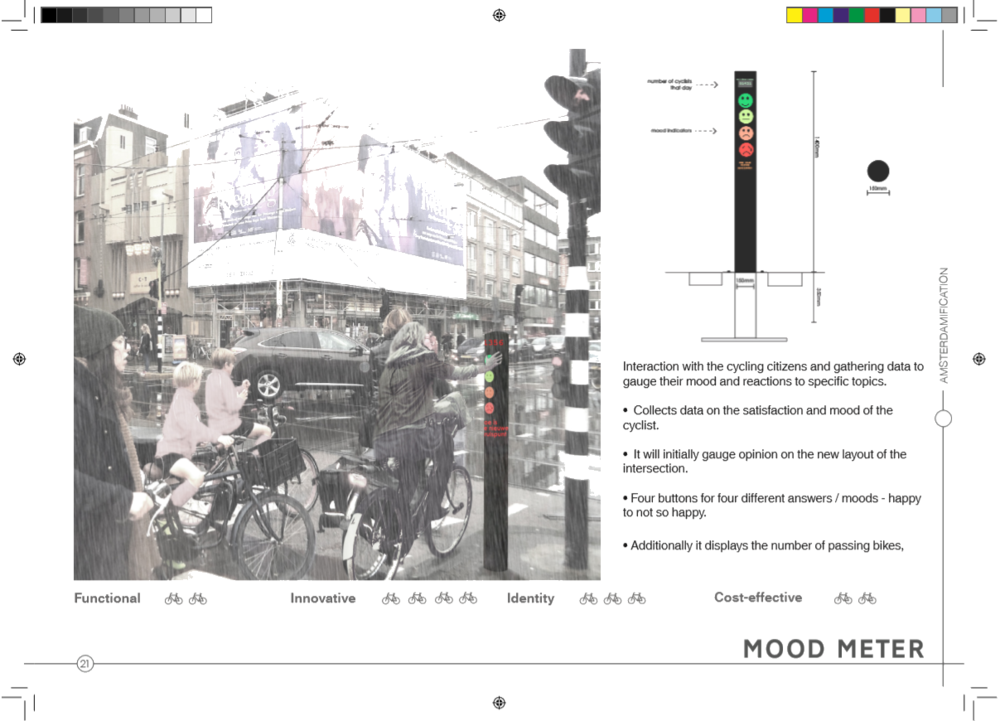
Leaning on Data
As an extension of the above idea of the Love Handle, Mikael conceptualised combining both something to lean on at the light with the established idea of giving feedback. You’ve seen the bright buttons at supermarkets and in airports but here the City can placed temporary feedback buttons at newly-designed intersections to gain a sense of the public acceptance. It provides some interactive gameification, gathers feedback and provides something to hold on to all at once.
Status: Concept
